
Prompt :
Apply a cinematic Teal and Orange color grade. Push the deep shadows and mid-tones towards a cool, cyan-blue hue, while warming the highlights and skin tones with rich golden-orange undertones. Create a high-contrast look with crushed, deep blacks and bright, punchy highlights on the cheekbones and bridge of the nose. Add a subtle horizontal anamorphic lens flare across a light source in the background. Sharpen the details in the eyes and hair.
Hard Rule: Do not change the face and hairs of the subject; preserve every original detail of the photo unchanged.
Result 👍

Prompt :
Transform the lighting into a cinematic “Golden Hour” sunset. Position a powerful, warm light source directly behind the subject, creating a brilliant golden rim light that outlines the hair, ears, and shoulders. This backlight should create a strong lens flare and a soft, glowing halation effect around the head. The front of the face remains in soft, warm shadow, lit by gentle bounce light. Add a layer of fine dust motes dancing in the sunbeams.
Hard Rule: Do not change the face and hairs of the subject.
Result 👍

Prompt :
Apply a bright, high-key winter lighting filter. The color palette should be dominated by whites, soft greys, and icy blues. Add a “frozen” look to the atmosphere with a light, sparkling silver haze. Lighting should be extremely soft and diffused, minimizing shadows. Add a subtle frost-like shimmer to the stray hair strands and a “cold-kissed” rosy tint to the cheeks and lips. Enhance the clarity of the glasses and eyes for a piercing, crystalline look.
Hard Rule: Do not change the face or hair of the subject; keep all original features perfectly intact.
Result 👍

Prompt :
Apply a classical Chiaroscuro painting style. Use a single, dramatic light source from the side to create deep, soulful shadows and rich, golden highlights. The skin should have a luminous, oil-on-canvas texture with subtle, warm undertones. Enhance the micro-contrast in the iris of the eyes to make them “pop.” The background should be a dark, textured umber. Apply a very fine crackle glaze or subtle canvas texture over the image.
Hard Rule: Do not change the face or hair of the subject; all original facial proportions and details must remain identical
Result 👍
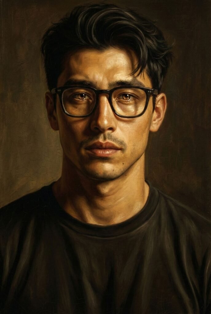
Prompt :
Apply a classical Chiaroscuro painting style. Use a single, dramatic light source from the side to create deep, soulful shadows and rich, golden highlights. The skin should have a luminous, oil-on-canvas texture with subtle, warm undertones. Enhance the micro-contrast in the iris of the eyes to make them “pop.” The background should be a dark, textured umber. Apply a very fine crackle glaze or subtle canvas texture over the image.
Hard Rule: Do not change the face or hair of the subject; all original facial proportions and details must remain identical
Result 👍

- This update keeps the original angle of Useful prompts for nano banana part 1 and adds a clearer decision framework, practical checklist, FAQs, and conversion-focused next steps.
- Readers should leave with a better understanding of what to do first, what to avoid, and when to ask for expert support.
- The guidance is additive only: title, slug, and core angle are preserved.

How to use this guide in practice
Treat this article as a starting point, then connect the advice to your business model, customer journey, and current marketing stack. A useful implementation plan should identify the outcome, the first action, the owner, the metric, and the point where the work needs expert review. For broader support, compare the recommendation with Media87 digital marketing services at Media87.
| Decision area | Practical check | Risk to avoid |
|---|---|---|
| Goal | Define the commercial result before choosing tools or tactics. | Doing activity that does not connect to leads, sales, retention, or trust. |
| Workflow | Break the work into a simple first version, then improve it monthly. | Building a complex system before proving the basics. |
| Measurement | Track a small set of useful KPIs and review them regularly. | Reporting vanity metrics without decisions attached. |

FAQs
What should I do first?
Start with the highest-friction step in the current workflow, then improve one measurable outcome before adding complexity.
When should I ask for help?
Ask for help when the work affects revenue, customer experience, tracking accuracy, or public brand trust.
How often should this be reviewed?
Review performance monthly and update the process when customer behaviour, platform rules, or business priorities change.
- Subject: name the main scene, object, person, or business asset clearly.
- Purpose: explain whether the output is for a blog header, ad creative, product concept, social post, storyboard, or internal mockup.
- Style: describe the visual language with references such as editorial business photography, clean isometric illustration, premium agency magazine, or minimal product render.
- Constraints: say what to avoid, especially readable text, random logos, distorted hands, cluttered backgrounds, and fake interface labels.
- Output fit: include aspect ratio, composition, safe empty space for cropping, and where the image will appear on the page.
How to write stronger Nano Banana prompts
The easiest way to improve Nano Banana results is to stop writing prompts as short labels and start writing them as production briefs. A weak prompt says only what the image is about. A stronger prompt explains the scene, the intended use, the visual standard, the composition, and the quality controls. This matters because image models often fill gaps with generic details. If you do not describe the brand feel, the model may choose stock-photo lighting, random objects, fake text, or a layout that looks disconnected from the article.
For a business blog, the prompt should usually begin with the communication goal. For example, instead of asking for an image about marketing automation, ask for a premium editorial business illustration that helps a reader understand a marketing automation workflow. That single change tells the model that the output needs to support comprehension, not just look decorative. Then add the audience and context: agency owners, restaurant teams, ecommerce managers, training companies, or UAE service businesses. Specific context makes the visual feel less generic.
The second layer is style control. Useful prompts name the visual family clearly: editorial photograph, clean isometric illustration, simple vector diagram, realistic product mockup, cinematic office scene, or abstract process map. Mixing too many styles in one prompt can confuse the result. If the article is for a professional digital marketing site, a controlled palette, clean composition, and magazine-like framing often work better than fantasy effects, busy neon graphics, or cliché robot imagery.
| Prompt part | What to specify | Why it improves the output |
|---|---|---|
| Scene | Main subject, setting, people or objects, and the business situation. | Prevents the model from inventing an unrelated generic scene. |
| Use case | Blog hero, framework visual, social post, website banner, ad concept, or product mockup. | Guides composition, spacing, and level of detail. |
| Style | Editorial, clean isometric, premium vector, realistic, minimal, or brand-led illustration. | Keeps the image aligned with the page and client brand. |
| Negative constraints | No readable text, no logos, no fake UI labels, no distorted hands, no clutter. | Reduces the artifacts that make AI images look unprofessional. |
| Validation | Check crop, clarity, relevance, artifacts, and alt-text fit before publishing. | Turns image generation into a reliable workflow instead of a one-click gamble. |
Prompt examples by practical use case
Blog hero prompt: “Premium editorial business illustration for a digital marketing blog about AI image prompts. Show a marketing strategist planning campaign visuals on a clean desk with abstract image concept cards, analytics shapes, and a modern agency color palette. Landscape composition, polished magazine lighting, no readable text, no logos, no fake interface labels.” This works because it gives the model a subject, purpose, setting, style, and clear artifact restrictions.
Framework visual prompt: “Clean isometric business framework showing a five-step creative workflow: brief, style direction, generation, quality review, and publishing. Use abstract icons and connected cards without any words or labels. Deep teal, white, and warm amber accents, spacious layout, suitable for a professional marketing article.” This is stronger than asking for a “prompt framework image” because it describes the structure without relying on text inside the image.
Product or service concept prompt: “Realistic-but-polished website banner concept for an agency service page about AI-assisted content production. Show a small team reviewing visual concepts and content blocks on a large screen, with natural business lighting and a premium modern office feel. Keep faces natural, avoid brand logos, avoid readable dashboard text, and leave clean space on the right for website cropping.” This prompt anticipates real publishing needs, especially cropping and brand safety.
Common Nano Banana prompt mistakes
One mistake is asking for too much inside one image: multiple scenes, several visual styles, a full infographic, product UI, people, charts, and labels all at once. The result may look impressive at a glance but fail quality review because the details are incoherent. A better approach is to split the requirement into two assets: one emotional hero image and one separate framework visual. That gives each image a job and makes QA easier.
Another mistake is allowing text in the image. Even strong image models can produce misspellings, pseudo-letters, or fake interface labels. For client work, text should normally be added in the design or web layer, not baked into the generated image. Prompts should say “no readable text, no labels, no logos” and the final image should still be checked visually before upload. If text artifacts remain, regenerate rather than publishing a flawed asset.
A third mistake is ignoring where the image will appear. A blog hero needs a different composition from an in-article diagram. The hero should be visually attractive and immediately relevant. The mid-article visual should clarify a process, comparison, or decision. If both images have the same purpose, the article feels decorative rather than useful. Strong prompts define the role of the asset before describing the scene.
A repeatable workflow for prompt-led visuals
Start with the article title and identify what the reader needs to understand faster. Then choose the asset type: a hero, process visual, comparison framework, checklist, product mockup, or campaign concept. Write a one-paragraph prompt with subject, use case, style, constraints, and output format. Generate one or more candidates, reject anything with text artifacts or off-brand details, convert the chosen image to WebP, and write alt text that describes the image honestly rather than stuffing keywords.
For Media87-style publishing, the best prompts are not just creative. They are operational. They make the image easier to approve, compress, upload, describe, and verify on the live page. That is the difference between a fun AI experiment and a production-ready visual workflow for client content.
Extra FAQs for Nano Banana prompting
Should prompts include brand colours?
Yes, when the image is for a website or client article. Brand colours help the output feel consistent with the page. Use them as palette guidance, not as a demand for exact colour matching unless the design workflow supports that level of control.
Should I ask Nano Banana to create text inside images?
Usually no. For professional publishing, generated text is a common quality risk. Keep text, labels, and headings in Gutenberg, Canva, Figma, or the page design layer where they can be edited and checked.
How many image options should be generated?
For important public assets, generate more than one candidate when budget allows. A single image can pass technical checks but still feel generic, off-brand, or visually confusing. Comparing two or three options usually leads to a better final asset.